Featured Project
Art’s Plus
The Product:
ART’s Plus app goal is to attract and retain customers that are on the go via our mobile app. We’re looking to improve sales by increasing customer satisfaction and in turn maximizing customer retention.
Project duration:
12/21 – 01/22
The problem:
Retaining customers and increasing product sales.
The goal:
Construct an app that give users a simple way to buy and earn points for artwork.
My role:
UX Researcher, UX Designer, and UI Designer
Responsibilities:
Paper and digital wireframes, conducted interviews, accounting for accessibility, conducted usability studies, low and high prototyping, and iterating on designs.
User Research: Summary
I conducted interviews and created empathy maps to understand the users and their needs I’m designing for. A primary user group identified through research were users want to feel appreciated. This user group explained being treated like a number by other apps, Other user problems included difficulty navigating through the app and notifications about art availability.
User Research: Pain Points
Unique Product
Users find it difficult to find quality and unique artwork.
Time
Users want to save time looking for quality art venues
Valued
Users are not feeling valued and are treated like another number.
Design/Layout
Difficulty to navigating through the app.
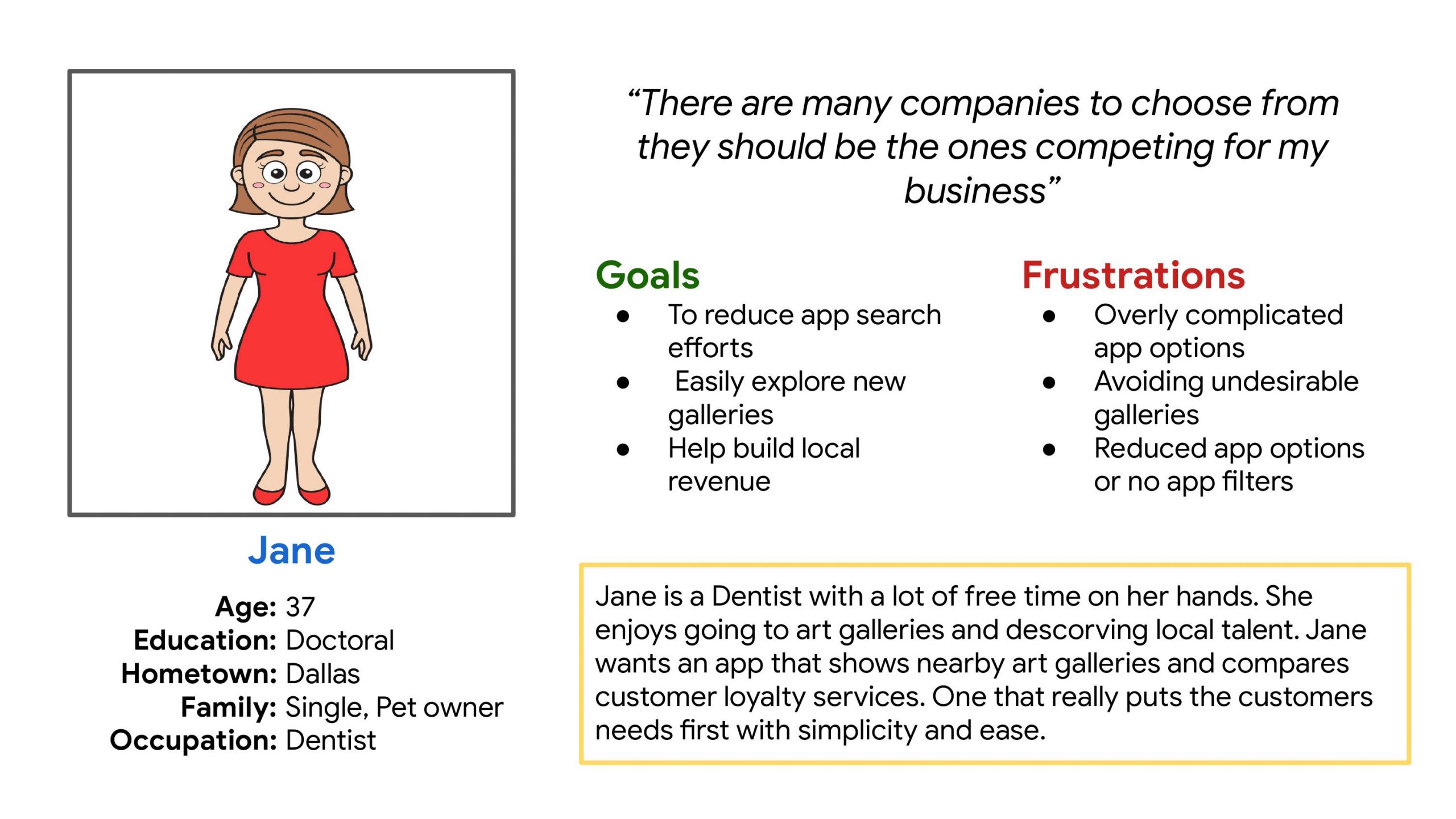
Persona Jane
Problem statement: Jane is an Dentist who needs a quicker way to find art venues and compare customer loyalty rewards.
Persona Jane
Problem statement: Jane is an Dentist who needs a quicker way to find art venues and compare customer loyalty rewards.
User Journey Map
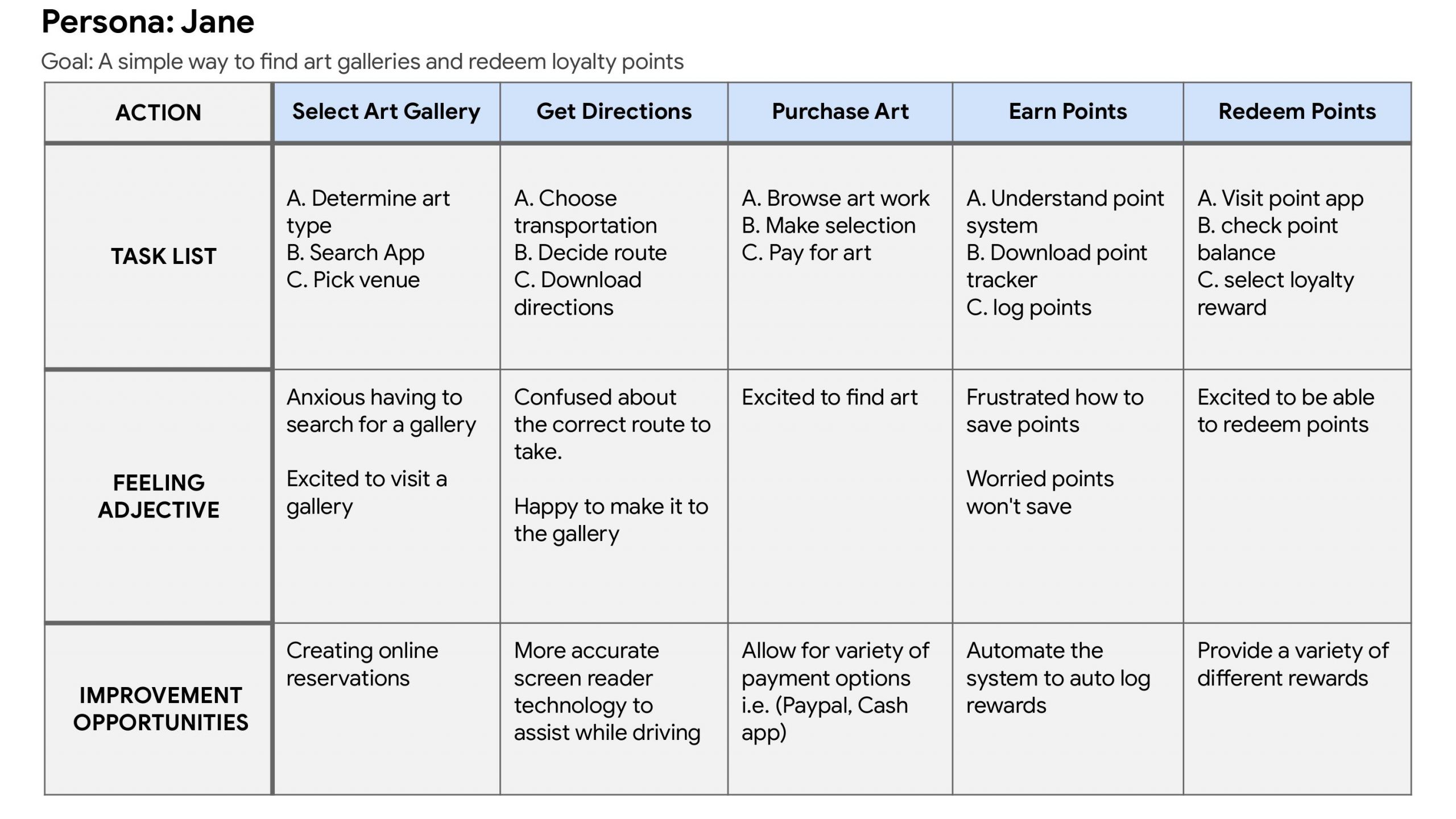
Mapping Jane’s user journey disclosed how convenient it would be for users to find buy and earn rewards on Art’s Plus app.
Paper Wireframes
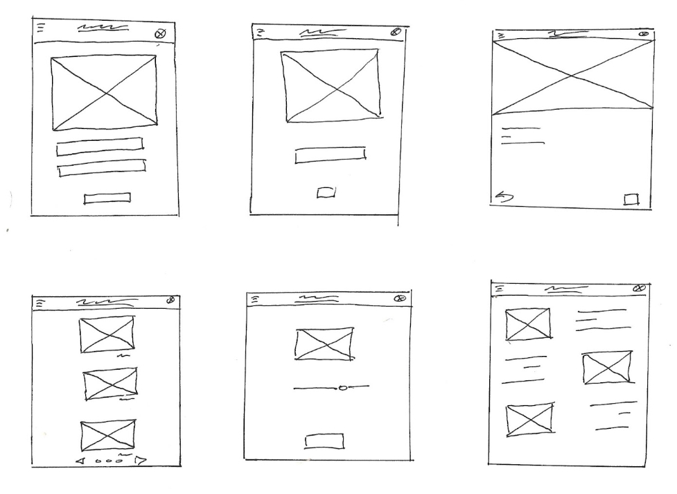
Using time to design different variations of each screen of the app on paper guaranteed that the elements that made it to digital wireframes would fit just right to address user pain points. For the home screen, I prioritized a quick and easy to use map to help users save time.

Digital Wireframes
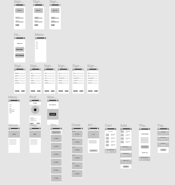
Based on feedback users wanted the option to use as many or little points as desired. As the initial design phase continued, I made sure to base screen designs on feedback and findings from the user research.
Low-Fidelity Prototype
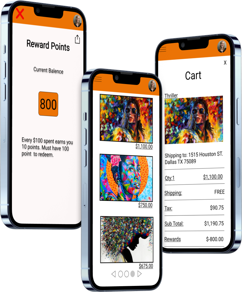
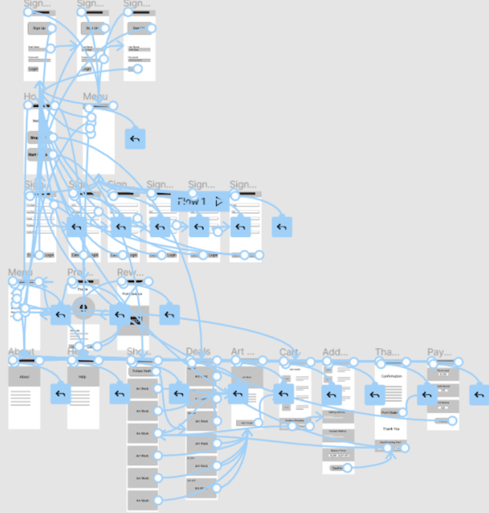
The low-fidelity prototype linked the primary user flow of earning and using rewards points.
View Art’s Plus App Lo-Fi Prototype

Mockups
High-Fidelity Prototype
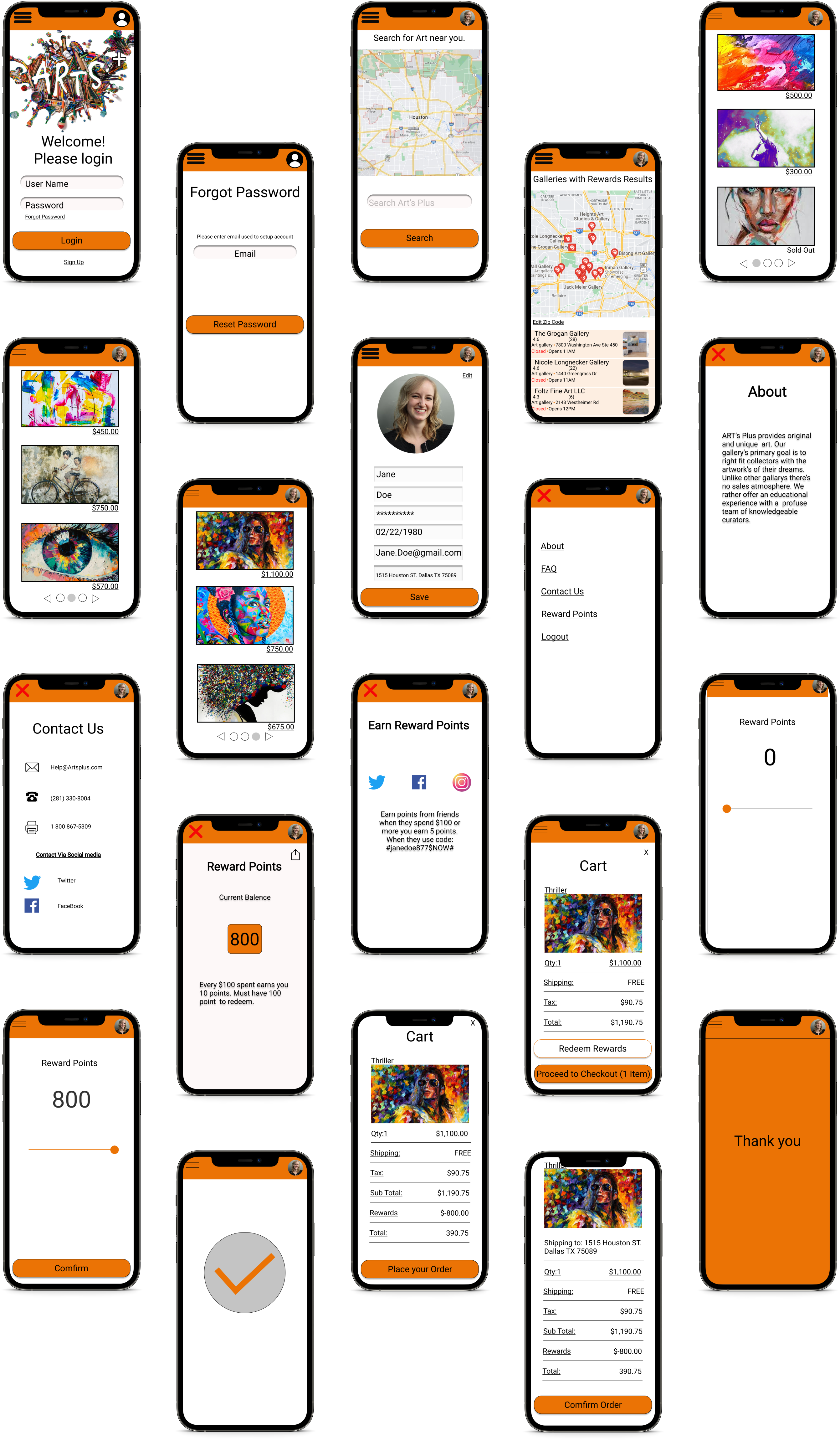
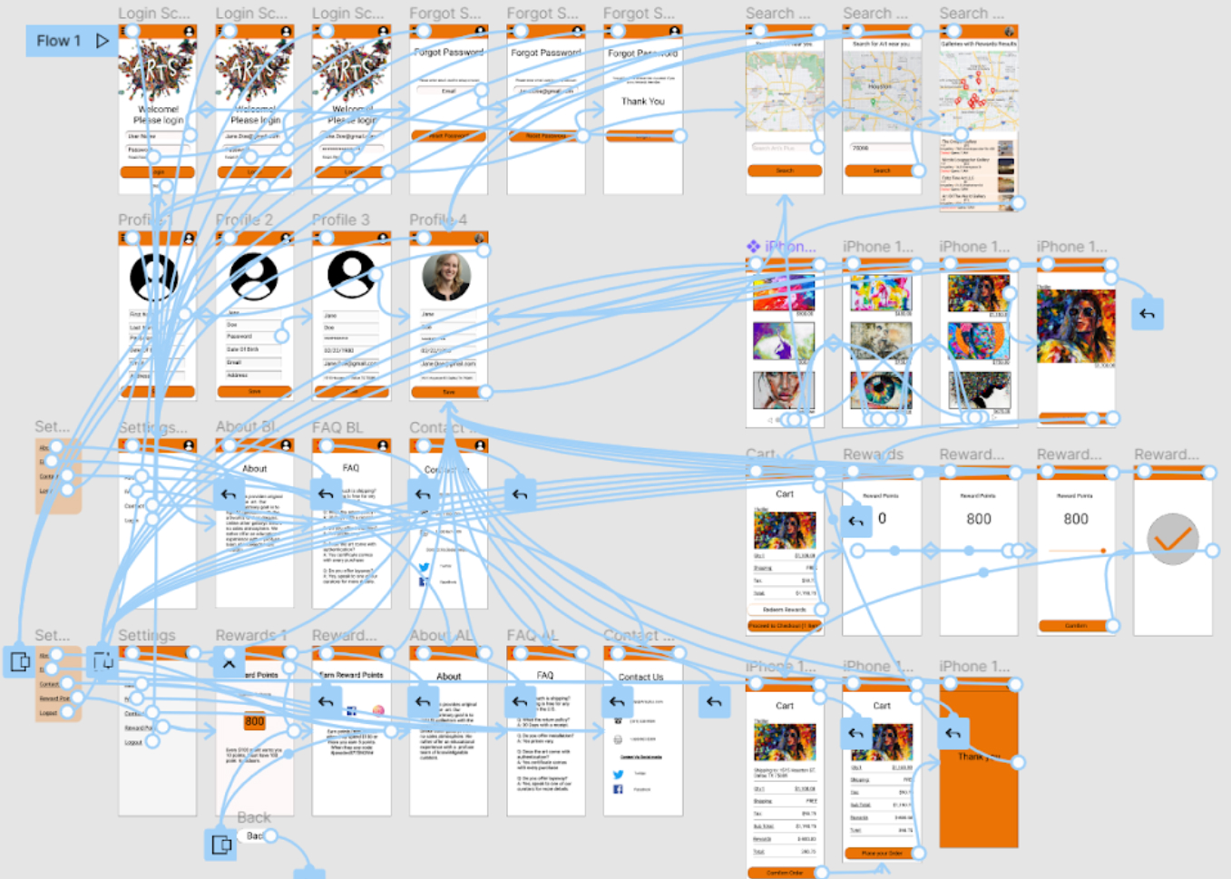
The final high-fidelity prototype presented cleaner user flows for purchasing art. Met the user needs with easy search features and by having more options on how any points to use at checkout.
View Art’s Plus App Hi-Fi Prototype
Impact: Art’s Plus is a great app for new talent to be discovered. Its focus is for small micro business that want to vibrant colors to what can sometimes be a discouraging world.
What I learned: While designing the Arts Plus app, I learned during the initial process you can start with an idea and watch it change and grow into something totally different. However usability studies and peer feedback can smooth out the process on specific goals that need to be accomplished before the delivery process.
Organize more user research to resolve any problems that are found.
Verify if the issues users experienced have been adequately addressed.
Update the app for better user experience.
