T-Burn
The Product:
The objective of the T-Burn application is to simplify the user’s experience and encourage a healthier lifestyle. Our aim is to promote healthy living by simplifying the process of exercising and eating well, thereby increasing customer engagement and time spent on these activities. By streamlining these activities, we hope to make it easier for users to adopt a healthier lifestyle and improve their overall health and well-being.
Project duration:
9/15/22-10/21/22
The problem:
Integrate food, entertainment, workouts, progress, and group sharing in one app.
The goal:
Design an app that’s simple to use and provides all tools necessary for users to enjoy working out. Therefore allowing users to live longer fuller lives.
My role:
UX Researcher, UX Designer, and UI Designer
Responsibilities:
Paper and digital wireframes, conducted interviews, accounting for accessibility, conducted usability studies, low and high prototyping, and iterating on designs.
User Research: Summary
After conducting interviews and creating empathy maps, I was able to gain a deeper understanding of the needs of the users I am designing for. Through my research, I identified a primary user group that values the importance of social media sharing. This group expressed frustration with not feeling motivated or connected to friends and family during their health journey. Other user issues included lack of simplicity and the need to use several apps to achieve results.
User Research: Pain Points
Multiple Apps
Users find it annoying to have to download several apps to track workouts, nutrition, and music.
Time
Users want to save time by working out at home with simple but effective workout steps.
Staying Motivated
Users do not feel motivated to exercise alone and would like friends and family to compare progress with.
Technology Integration
Being able to use wearable fitness trackers, virtual workout classes, and personalized nutrition plans for users.
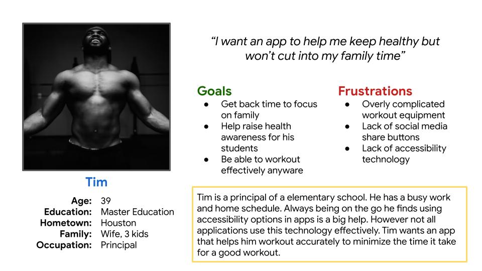
Persona Tim
Problem statement: Tim is a Principal who needs a app to help him workout accurately because he wants to be able to spend more time with his family.
Persona Jane
Problem statement: Jane is an Buyer who need a all in one app to match her busy on the go lifestyle.
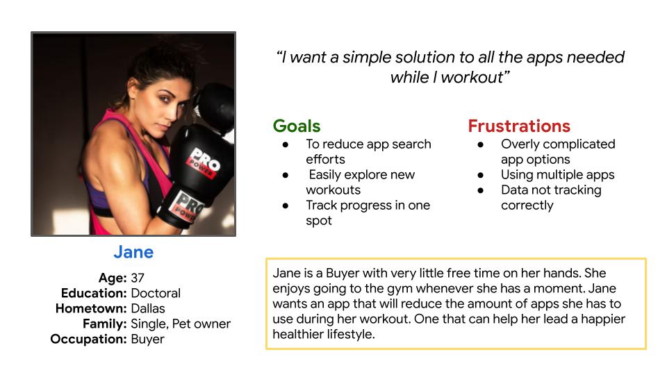
Persona Jane
Problem statement: Jane is an Buyer who need a all in one app to match her busy on the go lifestyle.
User Journey Map
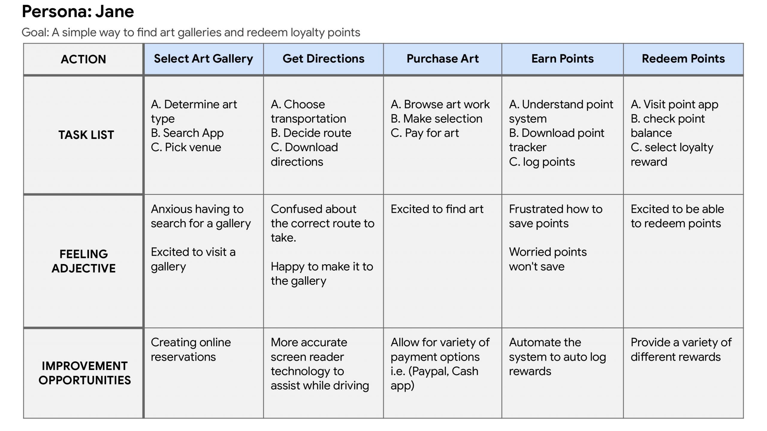
After mapping Jane’s user journey, it became clear that users would benefit from the app’s features for meal prepping, reviewing past exercise sessions, and sharing with others.
Paper Wireframes
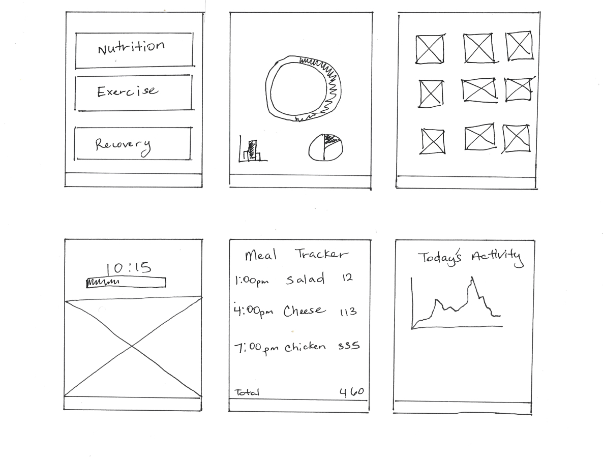
By dedicating time to creating multiple paper designs for each screen of the app, I ensured that the digital wireframes addressed user pain points in the most effective way possible. Specifically, I placed high priority on providing users with a quick and easy overview of their progress on the home screen. This empowers users to modify their workouts according to their focus areas, saving them time while achieving a more effective workout.

Digital Wireframes
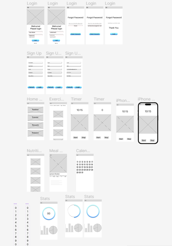
In response to user feedback, it was suggested that the app should provide the option to combine multiple apps into a single platform. This would enable users to optimize their workflow by minimizing the time and effort spent switching between different apps, and allow them to seamlessly share their progress with others. Such a feature would not only enhance productivity, but also boost motivation as users would be able to track their progress more easily and receive support from their peers via the app.
Low-Fidelity Prototype
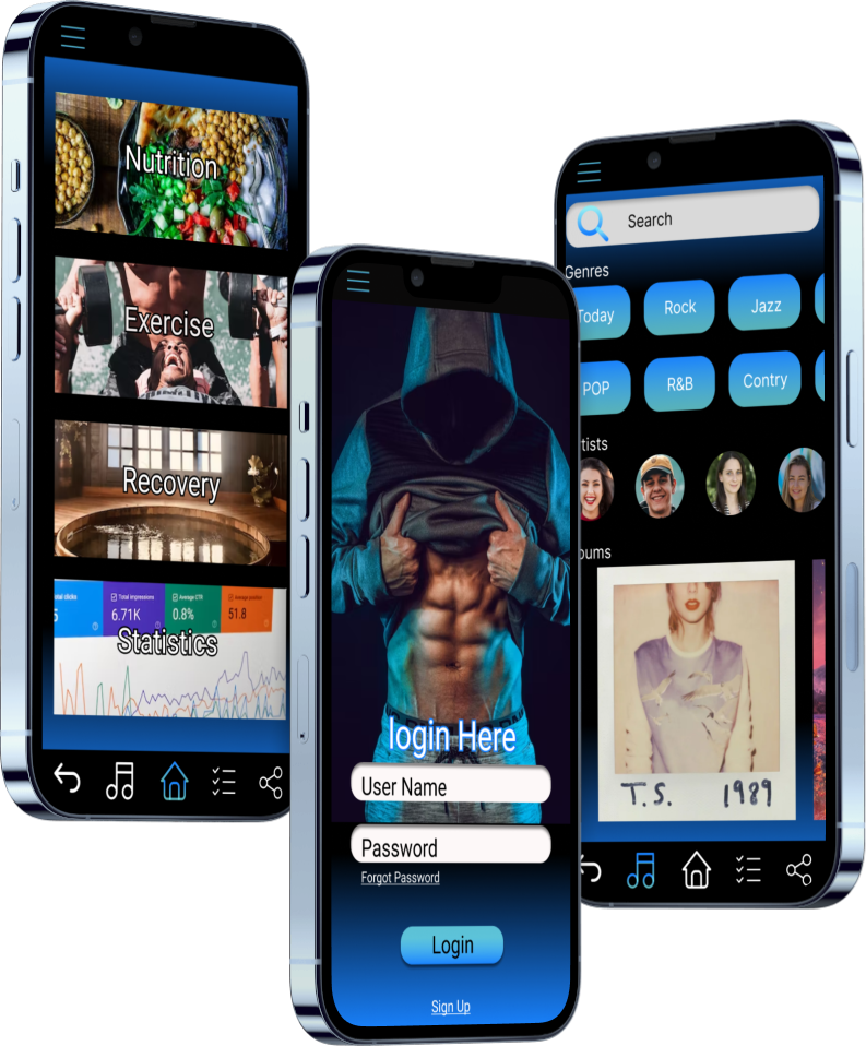
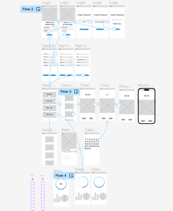
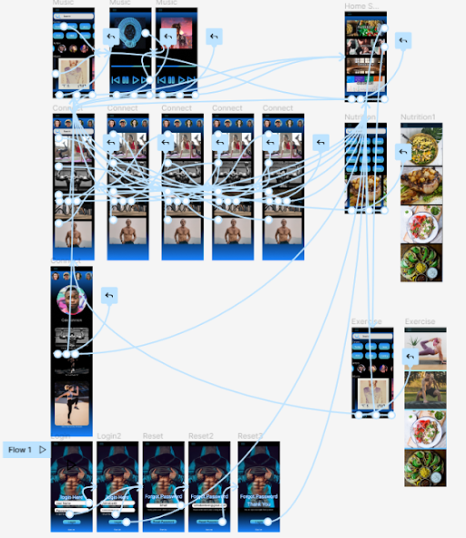
The low-fidelity prototype linked the primary user flow of meal prepping reviewing exercise and statistics
View T-Burn App Lo-Fi Prototype

Mockups
High-Fidelity Prototype
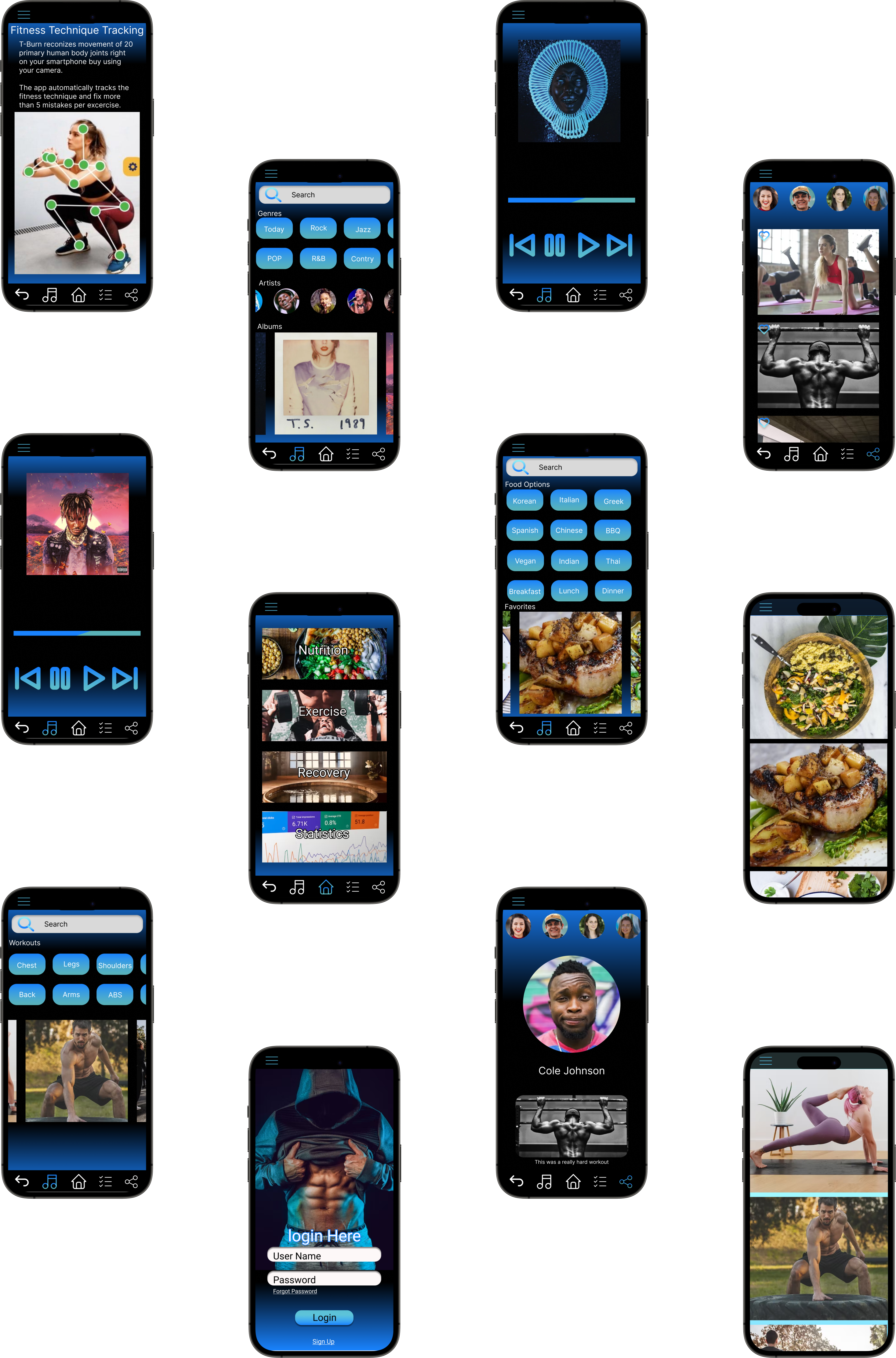
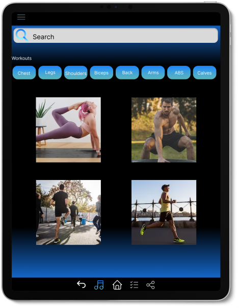
The high-fidelity prototype that was presented showcased improved user flows for meal preparation, exercise routines, and progress sharing with family and friends. With this new design, users can now combine multiple apps into one, which saves time and provides a more efficient experience. This design was tailored to meet the users’ needs and preferences for a seamless and streamlined app.
View T-Burn App Hi-Fi Prototype
Impact: T-Burn empowers those with busy schedules to achieve their health and fitness goals by maximizing their exercise and healthy eating habits.
What I learned: During the design process of the T-Burn app, I discovered that an initial idea can evolve and transform into something entirely different. However, conducting usability studies and receiving feedback from peers can help refine the process and ensure that specific goals are achieved before delivery.
Organize more user research to resolve any problems that are found.
Verify if the issues users experienced have been adequately addressed.
Update the app for better user experience.
